
Readable Glass Door Logos for Businesses: Exact Sizes & Placement
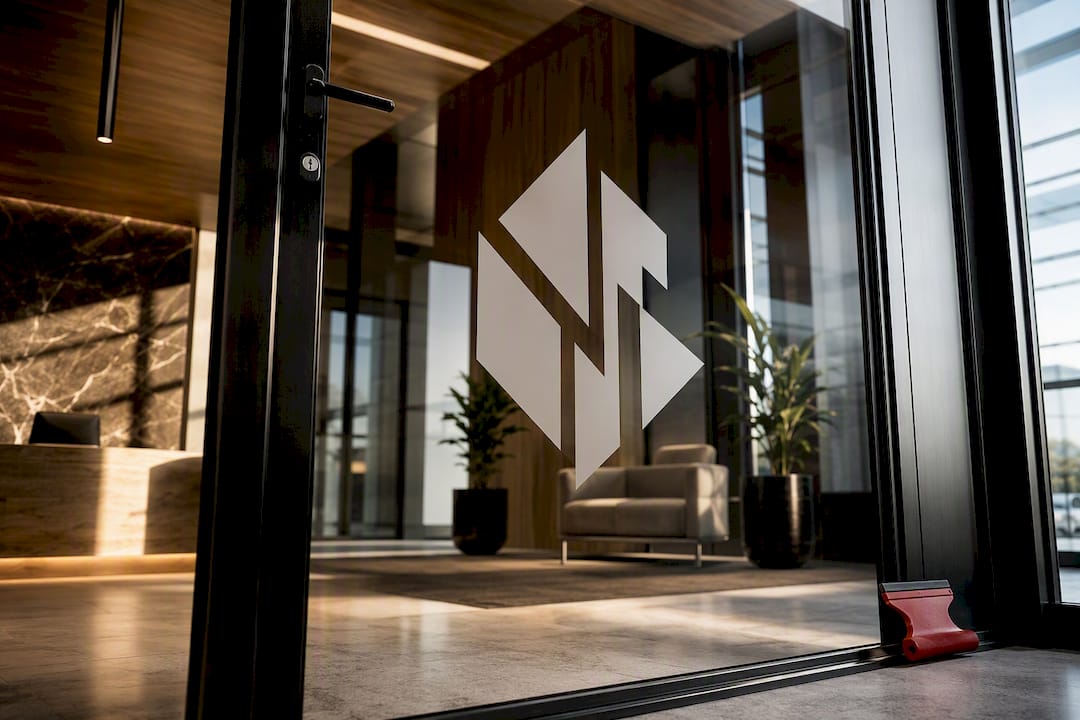
For most storefronts and offices, die-cut vinyl handles budget-friendly, temporary branding; frosted or decorative film gives you an etched look at a fraction of the cost, and direct-to-glass etching or dimensional lettering delivers permanent, high-end prestige. Measure your glass, decide how permanent you want the result, and either order a template or request a quote from a professional installer.
TL;DR:
- Die-cut vinyl is ideal for temporary storefront branding and updates, with installation typically taking less than an hour and easy removal.
- Frosted film offers privacy and a subtle etched look suitable for office doors, covering larger surfaces and doubling as a privacy barrier.
- Permanent, high-end options like etched glass and dimensional lettering are best for reception areas, executive offices, or flagship storefronts.
- Proper logo design on glass must consider size, contrast, negative space, and placement to ensure readability from typical viewing distances.
- Professional installation is crucial to ensure safety, durability, and precise placement, especially for illuminated or complex signage.
Table of Contents
- Which Materials Work Best for Glass Door Logos?
- How Do You Design a Logo That Reads Well on Glass?
- Where Should a Glass Door Logo Sit?
- What Safety Codes Apply to Glass Door Logos?
- Where Do Glass Door Logos Show Up in Real Spaces?
- What Does Installation and Upkeep Actually Involve?
- How Much Should You Budget and When Should You Start?
- Should You Hire a Professional for Glass Door Branding?
- What’s Coming Next for Glass Door Branding?
- How TWT SoCal Handles Storefront and Frosted Glass Branding
- Sources
Which Materials Work Best for Glass Door Logos?
The material decision comes down to three questions: how long do you want it to last, how much visibility do you need, and what’s the budget. Each option below answers those questions differently.
Die-cut vinyl is the workhorse of glass branding. It’s cut into the exact shape of your logo with no background sheet, so it reads as if it’s floating on the glass. Die-cut decals come in a wide range of letter heights and colors, and they’re typically applied from the inside facing out, which protects the graphic from weather and vandalism while keeping the finished look clean from the street. This is the right call for a new business testing a logo, a seasonal promotion, or any storefront that expects to update its branding within a few years. It works on interior and exterior glass alike, though exterior installations lean toward white or light colors for daytime visibility.
Frosted or decorative film creates a soft, etched appearance without the cost or irreversibility of actual glass etching. It’s the go-to for offices that want privacy on a conference room door while still displaying a logo, and it can be cut into patterns, bands, or a repeated mark that reads as texture from a distance and as branding up close. Compared to die-cut vinyl, frosted film covers more surface area and does double duty as a privacy layer.
Direct-to-glass etching and dimensional signage sit at the top of the permanence and prestige scale. Etching alters the glass itself; dimensional or standoff-mounted lettering adds physical depth with shadow lines that catch light. Both suit reception desks, executive boardrooms, and flagship storefronts where the logo is meant to feel built into the architecture rather than applied to it.
Illuminated or LED edge options push further into showpiece territory. Edge-lit acrylic logos or LED-outlined dimensional letters can cycle through colors and patterns, making them a strong choice for a lobby focal point or a nighttime storefront draw. They require power access and usually a licensed electrician alongside the sign installer, which adds cost and lead time.
- Die-cut vinyl: cheapest, fastest, easiest to remove or replace.
- Frosted/decorative film: mid-cost, adds privacy, mimics etching.
- Direct etching/dimensional: highest cost, permanent, premium feel.
- Illuminated/LED: premium cost, requires electrical work, maximum visual impact.
How Do You Design a Logo That Reads Well on Glass?
Glass is unforgiving. Unlike a printed sign with a solid backdrop, your logo competes with whatever’s happening on the other side of the door, changing sunlight, foot traffic, and reflections included.
Start with distance. Design experts recommend sizing primary glass signage so the main message is readable from a distance that covers typical pedestrian approach from sidewalks or parking areas, which covers pedestrians approaching from the sidewalk or parking lot. That distance dictates letter height more than any style preference. A logo that looks sharp on a laptop screen often shrinks to an unreadable smudge once it’s scaled down to fit a 32 inch by 80 inch door panel.
Contrast matters as much as size. Glass has no fixed background, so a logo that looks crisp against a dark interior can vanish against bright daylight glare. A few fixes solve this reliably:
- Add a thin outline or drop shadow so the mark holds up against both light and dark backdrops.
- Use a subtle frosted panel behind the logo to create consistent contrast regardless of what’s visible through the glass.
- Stick to one or two colors. Multi-color, gradient-heavy logos lose definition fast on a transparent surface, while minimal, single-color marks with controlled negative space read far more clearly.
Negative space is your best friend here. A cluttered glass logo with a tagline, hours, and three icons crammed together reads as noise from any distance. Strip it down to the mark and, if needed, one line of text. Treating glass graphics as an architectural element rather than surface decoration keeps the design from competing with the space it’s supposed to enhance.
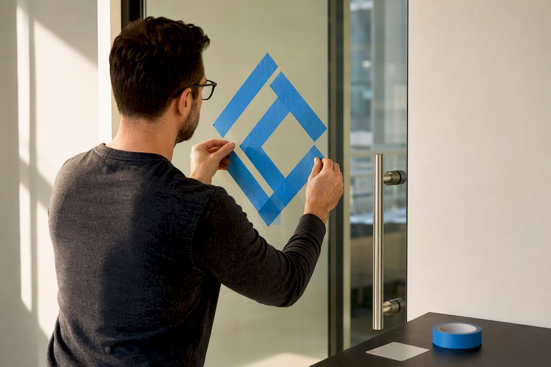
Pro Tip: Before you commit to a final design, cut a rough version out of painter’s tape or frosted contact paper and stick it to the actual door. Step back to your typical viewing distance, check it at different times of day, and you’ll catch legibility problems no screen mockup will show you.
Where Should a Glass Door Logo Sit?
Placement is where a lot of otherwise good designs fall apart. Getting the height and spacing right takes just a few measurements.
- Set the vertical band first. For adult sightlines, center the logo at an adult eye level height, with a lower secondary mark or pattern for children if they are a primary audience.
- Keep clearance from the edges. Leave at least 2 to 3 inches between any graphic and the glass edge, and stay clear of door handles, push bars, and hinge hardware by a similar margin so the design doesn’t interfere with hardware or wear from repeated contact.
- Scale to the setting. Storefront logos facing the street can run larger, often filling 30 to 50 percent of the door’s width, since they need to compete with sidewalk sightlines. Interior partition logos in a conference room or hallway can run smaller and more frequent, since viewers are closer and the goal is often texture and privacy as much as branding.
Measure twice before ordering. A logo cut to the wrong dimension because someone eyeballed the door height is one of the most common (and avoidable) mistakes in this whole process.
What Safety Codes Apply to Glass Door Logos?
Glass logos aren’t purely decorative. Large panes of clear glass are a documented walking hazard, and building codes increasingly expect some form of visual marking on them.
OSHA’s standard interpretations and ICC building code guidance address glass marking as part of general workplace and occupant safety, which means a logo placed at the wrong height or without enough contrast can leave a door technically out of compliance even if it looks great. The fix is straightforward: glass manifestation, using bands, dots, or a repeated logo motif at eye level, satisfies safety expectations while doing double duty as branding.
Practical patterns that work well:
- A horizontal band of your logo mark repeated every 12 to 18 inches across the width of the door.
- A single large logo positioned within the manifestation zone, generally between 30 and 60 inches from the floor.
- Frosted stripes or dots incorporating your brand color, spaced evenly enough to register as a visual barrier from a distance.
Manifestation requirements vary by jurisdiction and building type, so check with your building management or a local code official before finalizing placement on any large frameless glass panel. A quick call up front avoids a costly redo later.
Where Do Glass Door Logos Show Up in Real Spaces?
The right material pairing changes depending on where the door sits and who’s walking through it.
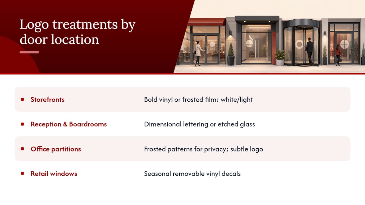
Storefronts need bold, high-contrast logos, often combined with hours of operation and essential contact information. Die-cut vinyl or frosted film both work here, and white or light colors hold up best against exterior glare. This is also where door wraps and logo stickers do double duty, covering safety compliance and street-facing branding in one installation.
Reception desks and boardrooms call for a different register entirely. Dimensional lettering or etched glass signals investment and permanence, which matters when a client’s first impression of your company happens at that door.
Office partitions and meeting rooms benefit from frosted patterns that build in privacy while repeating a subtle logo mark across the surface, a look that reads as architectural detail rather than an obvious sign. Some designers draw on residential glass door treatments for inspiration here; glass interior doors used for branding and privacy in upscale homes translate surprisingly well into small office suites and boutique retail fitting rooms.
Retail windows are the one place where seasonal, removable decals make the most sense. Promotions change monthly, so committing to etched glass here would be a waste. Vinyl decals let you refresh the look for a holiday sale without touching the permanent brand mark on the door itself.
What Does Installation and Upkeep Actually Involve?
Vinyl and film installations are fast. A trained installer squeegees the material onto clean glass, working out air bubbles with a felt-edged tool, and the whole process for a standard door typically takes under an hour. Applying from the inside where possible protects the graphic from weather and reduces the chance of vandalism damaging the visible surface.
Etching and dimensional signage take longer. Etching is either sandblasted or applied as a permanent etched-look film, and it can’t be repositioned once it’s set. Dimensional and standoff-mounted signs require drilling or adhesive-mounting hardware, which adds installation time and, in some cases, a second visit to align lighting for illuminated pieces.
Maintenance is where materials really diverge:
- Vinyl and film need regular cleaning with a non-ammonia glass cleaner. Ammonia-based products degrade adhesive over time.
- Direct sunlight exposure can fade lower-grade vinyl within a couple of years, while UV-stable films and etched glass hold their look far longer.
- Removal of vinyl or film is generally a same-day job for a professional, using heat and a scraper.
- Removing dimensional signage or reversing an etched treatment is far more involved and sometimes requires replacing the glass entirely.
Pro Tip: If there’s any chance you’ll rebrand within the next few years, don’t etch the glass. Choose a high-quality film instead. The etched look is nearly identical, and swapping it out later costs a fraction of what it takes to replace an etched pane.
How Much Should You Budget and When Should You Start?
Costs scale with permanence. Budget vinyl decals for a single door typically run in the low hundreds of dollars including installation. Mid-range frosted or decorative film costs more due to material coverage and labor time, especially for full-door or full-partition jobs. Premium etched glass, dimensional lettering, or illuminated signage sits at the top of the range once you factor in custom fabrication, mounting hardware, and any electrical work.
Lead times follow the same pattern:
- Vinyl decals: design approval to installation often happens within one to two weeks.
- Frosted film: similar turnaround, slightly longer if the pattern requires custom cutting.
- Etched or dimensional signage: expect several weeks for fabrication alone, plus scheduling for installation.
- Illuminated elements: add extra time for electrical coordination and testing.
A few variables push costs higher regardless of material: custom color matching to a specific brand palette, illuminated components, and any job requiring scaffolding or special building access for upper-floor storefronts.
Should You Hire a Professional for Glass Door Branding?
A logo that’s slightly off-center or bubbled under the vinyl undercuts the whole point of branding your entrance. Professional installation solves problems most business owners don’t anticipate: correct material selection for indoor versus outdoor exposure, clean edge work around handles and hinges, and a finish that holds up under years of door traffic.
The installer has experience providing window film installation in Southern California since 2008, often offering a lifetime warranty on jobs. Working with 3M and LLumar gives access to film grades that resist yellowing and edge lifting far longer than off-the-shelf vinyl.
When vetting any installer, ask these questions before signing a quote:
- What warranty backs the installation, and does it cover material defects or just labor?
- Which film or vinyl brands do they carry, and are those brands rated for your specific application?
- Can they show examples of similar glass door or storefront work?
- Does the quote include measurement, design proofing, and cleanup, or are those billed separately?
A vague answer to any of these is a red flag worth taking seriously.
What’s Coming Next for Glass Door Branding?
The direction for 2026 is toward restraint. Businesses that once crowded their glass with taglines, hours, social handles, and a logo are stripping it back to one clean mark, often in a single brand color, sized to work as an architectural detail rather than a sign bolted onto the building. That shift toward minimal signage aligns with what’s showing up across corporate office design generally.
The mistake I see most often is business owners treating glass like a blank billboard instead of a transparent surface with its own rules. Contrast, negative space, and honest sizing for your actual foot traffic distance matter more than cramming in every piece of information you think a customer needs. Balance transparency with visibility, not competition between them, and the door still functions as a window while doing the branding work.
— Jake
How TWT SoCal Handles Storefront and Frosted Glass Branding
If you’re weighing die-cut vinyl against etched glass right now, the fastest way to stop guessing is to get eyes on your actual door. Twtwindowfilm handles the full range this article just walked through, from retail storefront film built for high-traffic entrances to frosted graphics for offices that balance privacy with branding. Businesses concerned about vandalism or break-ins can also pair a logo installation with security film on the same visit, since both jobs use similar glass prep.
Installations typically include a warranty, and the films used come from well-known premium brands known for durability and resistance to yellowing and edge lift. That combination means the logo you approve today should still look sharp years from now, not just at the ribbon-cutting. Book a free on-site estimate through the full services page and get a firm quote before committing to a material or a design.
Sources
- A guide to glass manifestations
- Top 10 interior signage trends for corporate offices in 2026
- OSHA standard interpretations
- Die-Cut Window Decals - Custom Glass Door & Window Lettering
- Glass manifestation ideas for offices